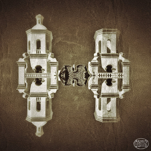
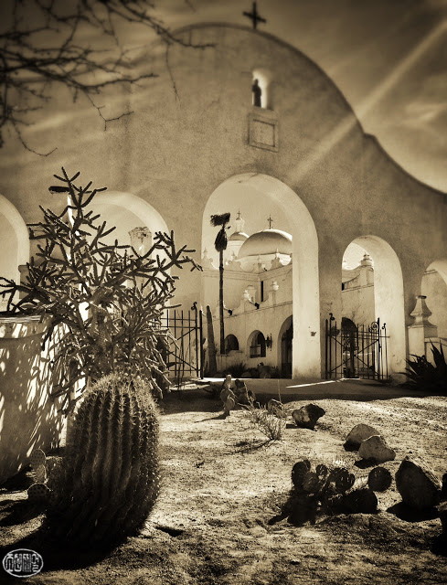
I'm so honored to have one of my images featured in this week's "1000 Word showcase" by the team of mobile artists JUXT:

Below is what I wrote for the showcase, including how I created the image:
A few days ago I was able to leave work earlier than usual–a
clear and warm spring afternoon–so I decided to go down to the Mission San
Xavier del Bac. I hadn’t been in a while, and It’s only a 15 minute drive from
downtown Tucson; the combination of desert sky, Native American culture and
18th-century Spanish colonial architecture is endlessly photogenic. The Mission
was originally founded in 1692, and the present structure dates from the
1780′s. The twin-towered facade is dominated by simple Moorish-influenced
towers flanking an intricate Baroque entryway. The eastern tower was never
completed–to my eye, it’s the asymmetry that makes the proportions more
interesting. (The almost-symmetry of human faces is what often gives us
visual personality, and it’s fascinating to find it in man-made structures.)
The whitewashed towers with crisp shadows against the afternoon sky reminded me
of some of Belgian painter Magritte’s famously surreal scenes–which made
me want to experiment with isolating some of the Mission’s architectural
details against the sky.
First I used Michael Baronovic’s (@MishoBaranovic) new
Perspective Correct app to straighten the lines of the towers. Then I cropped
the bottom, ‘ground’-half, off. Using PicFrame app, I ‘mirrored’ the remaining
facade, eliminating the frame between the two sections of the vertical diptych,
resulting in a seamless, symmetrical, floating-in-the-sky structure. For the
rest, I used snapseed. I de-saturated the image, then used the grunge filter,
choosing a texture that I find mimics parchment or handmade-paper. I like the
juxtaposition of photographically realistic detail imposed on a background that
evokes old surfaces used for illuminated manuscripts and East Asian scroll
paintings. Finally, I warmed the temperature a bit to get a sepia tone,
finishing with the center focus tool for a vignette effect.
(Last November was when I first started to play around with using cropped symmetry for a surreal effect. To see those first experiments, click here.)


